End-to-end redesign of the enterprise Human Capital subscription based service including research, tools, and platform migration.

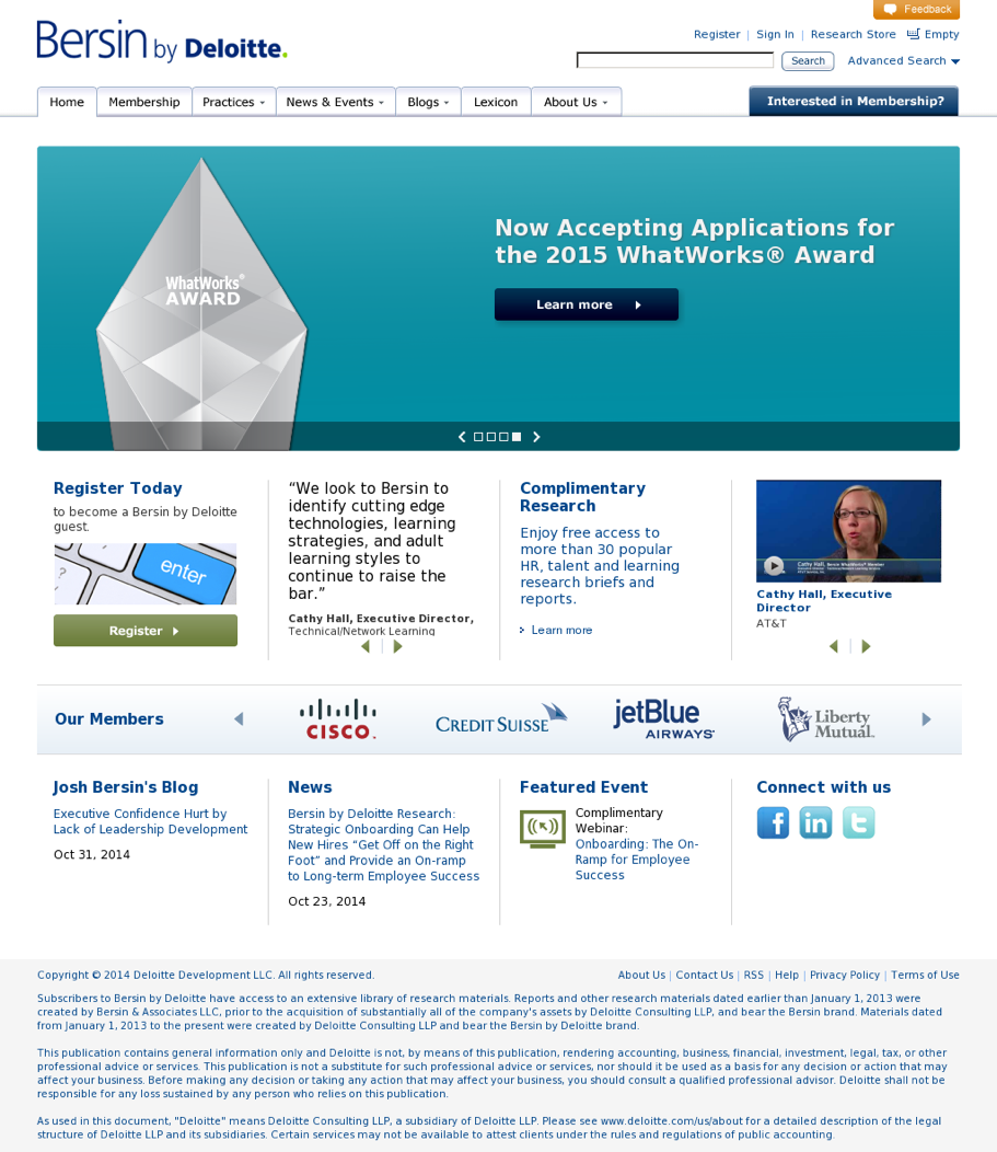
The Human Capital solution provider Bersin (founded by Josh Bersin) was acquired by Delloite in 2014. At the time they were servicing their client based using an older outdated non responsively designed web interface with a complex site structure and limited capability set. The primary output was published PDF's that clients would use to generate their own presentations or research documents.
When Bersin merged with Deloitte it became apparent that many of the business practices of the past were in need of modernization. Developing new ways to provide content, maintain privacy, and enhance customer experience was the major initiative laid down by Bersin and Deloitte's greater Human Capital Division (in which Bersin was now a part).
My role was Design Lead on a team of two designers working remotely in a distributed team across several States with an engineering team based in India. I interfaced with the Partner Director, VPs, Product Owners, and SME's on a daily basis.
Bersin Digital Moodboards
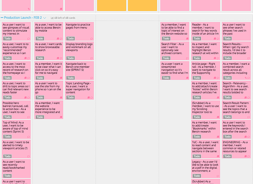
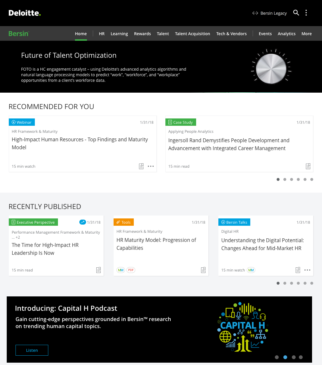
The business unit worked closely with design to layout a roadmap for the next version of the Bersin membership facing experience. The process involved paring down a bloated, feature rich, somewhat complex existing site into an MVP shell on which to build the 2.0 experience which would come to be known as Bersin Digital. Prior to my involvement on the team many new features were scoped and planned for the MVP release. Among these included the E Reader which would replace the outdated PDF download from the research, improved search and discovery, flattened IA and improved navigation, modernization of design and mobile enabled experiences when appropriate.
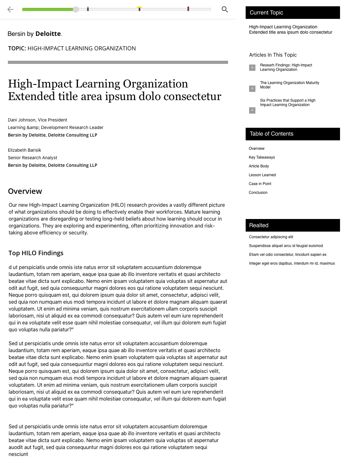
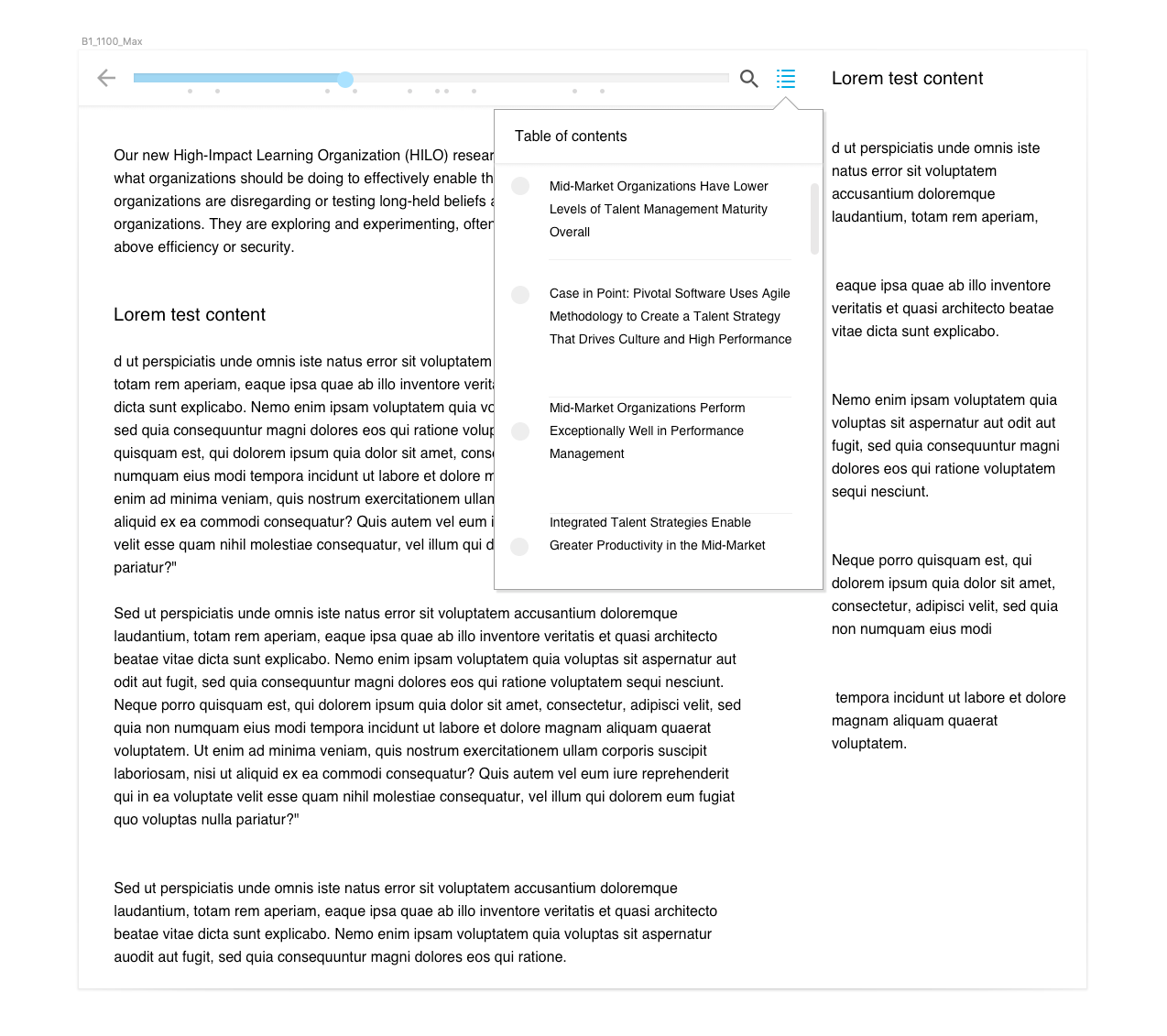
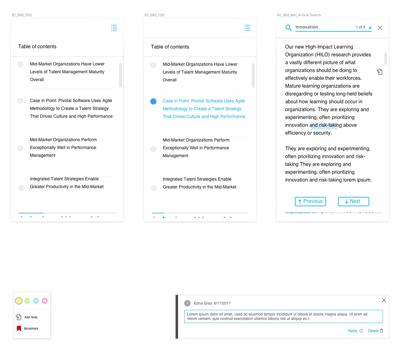
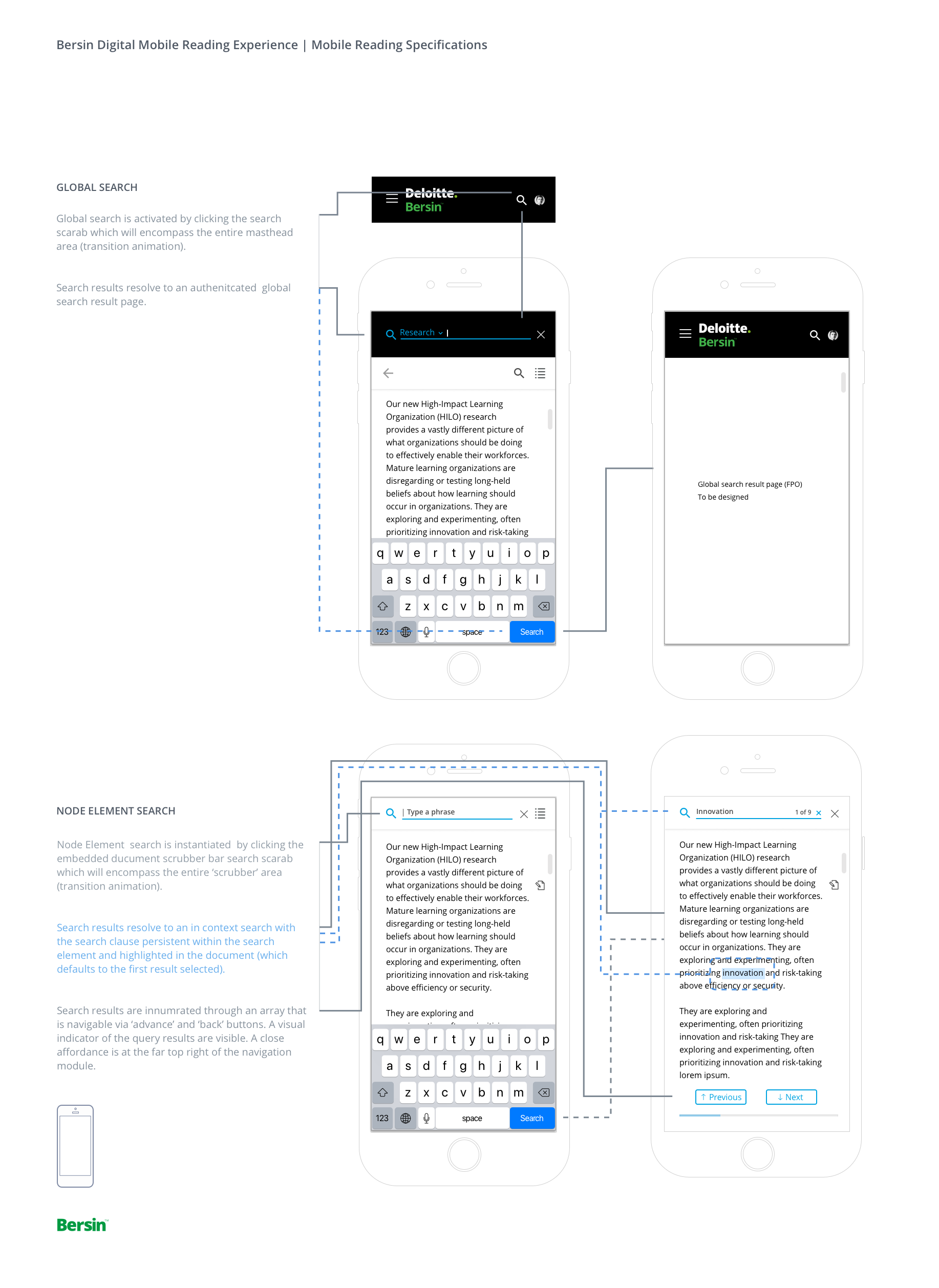
The conversion from the PDF reading format to a more secure fully digital E reader was my first design challenge to solve. This feature would be a unique experience as the reader would be mobile enabled (responsive), web based and include interactive features more commonly associated with native apps. This was a special set of requirements that needed to be designed with particular user criteria in mind.
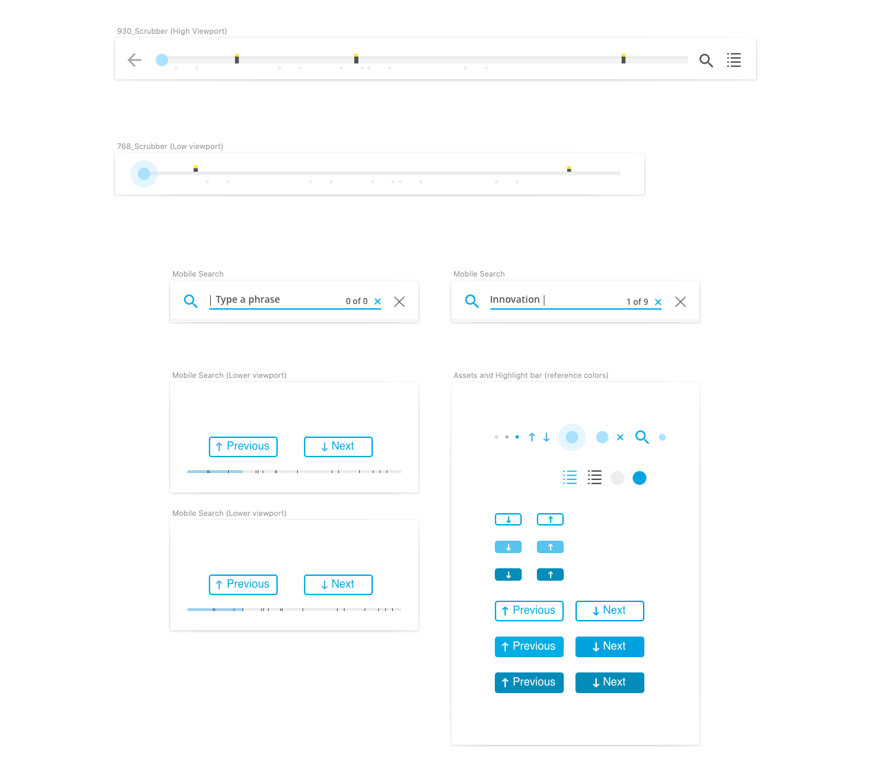
I began my work on the E Reader with some analysis of online and application based reading experience (including HC competitor experiences such as Bain and KPMG). I developed a straw man feature set and ran these ideas past some actual Bersin Subscribers for feedback. After several short interviews I validated that the set of proposed features would be the right ones to move forward with into the prototype phase. These features included, highlighting, bookmarking, notes and annotations, and activity history. In addition I designed an interactive scrubber bar feature that allowed the user to see at glance any content activity.
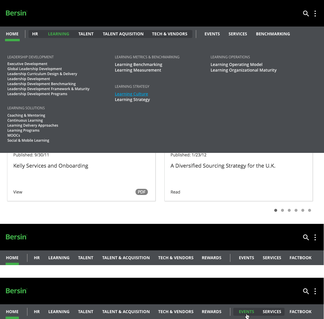
Another aspect of the Bersin Digital project was correcting the site structure. In the previous iteration the site was laden with unclear IA, a deeper than required site structure (content abstracts), and a collection of superfluous interstitial pages. My job was to propose a new flatter ‘leaner’ AI aimed at reducing clicks, improving way finding and removing elements that didn’t tie directly to content.
Once the new IA was established, approved by the business and validated by a few members through user interviews my next task was to design a more modern streamlined navigation.
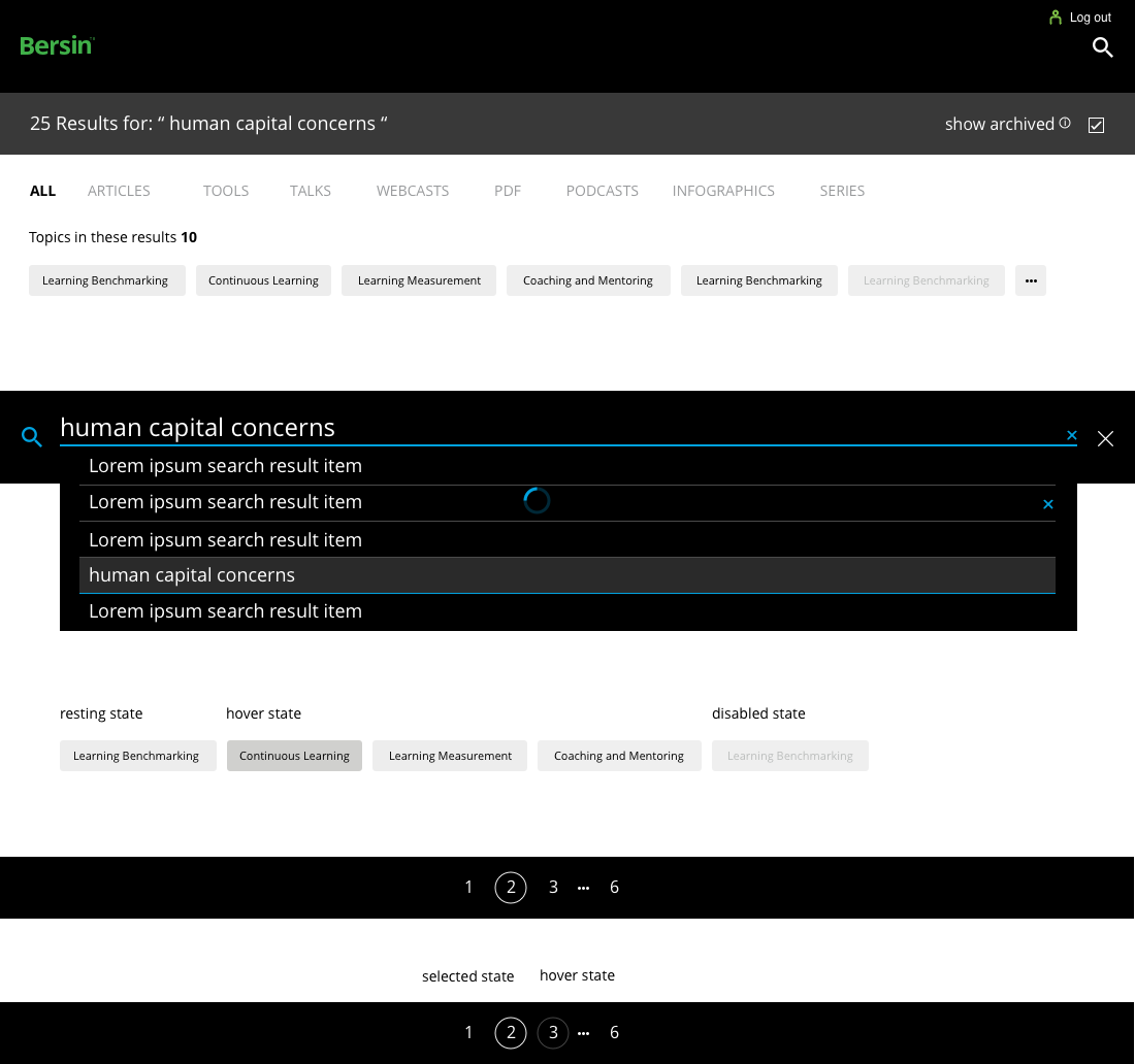
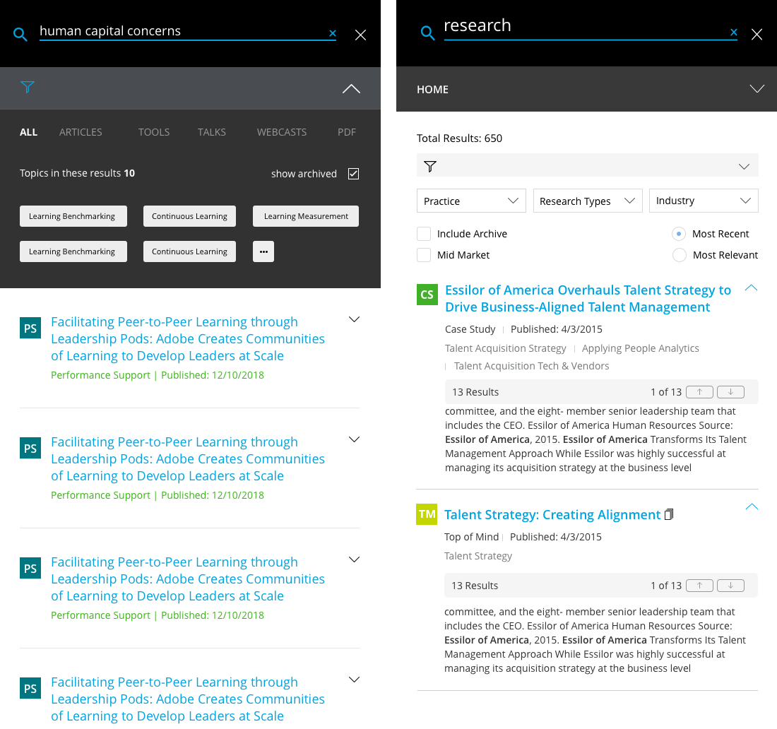
One of the biggest challenges for our users was being able to find relevant content buried inside of terminology rich content. The nature of the research made it hard to find unqiue concepts amidst so much redundant terminology heavy content. Solving this was not an easy task. The first aspect of search and discovery was improving the algorithmic calculations. Even with this improvement we still were faced with a content discovery problem. To solve this I conducted a number of interviews with users. The methodology consisted of looking at the advanced search features from the previous experience and try to determine what scopes and filters were missing from the new results. After a number of discussions with users it became clear which advanced filters were still required.
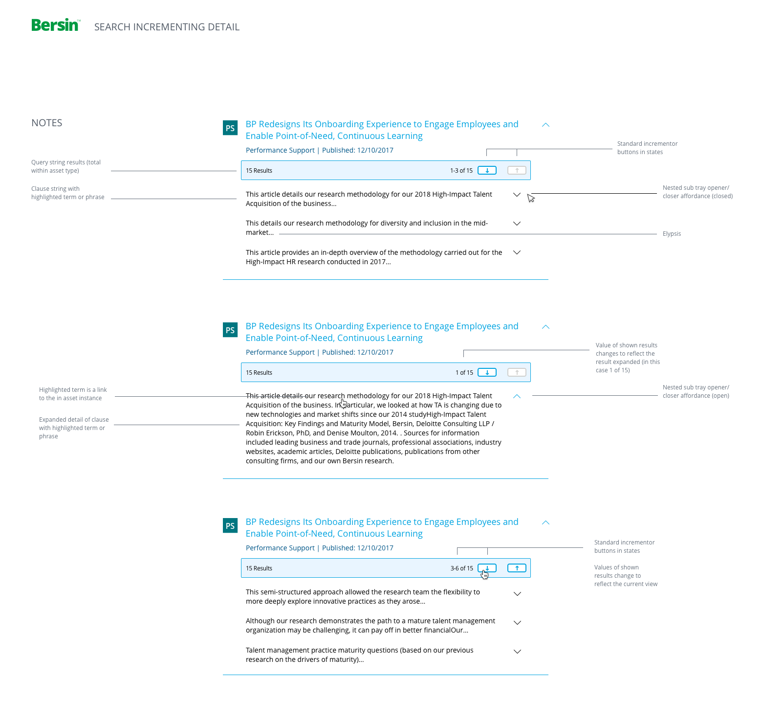
In addition to the inclusion of the new advanced filtering features I proposed a design enhancement which would allow users to browse research results without leaving the search results page. I called this 'Search incrementing browsing' This new feature was embraced by the user base because it eliminated the need to open a search result and browse down a page for a specific keyword.
As an enhancement to search results I designed a module that would allow the user to never have to leave the results page to browse for keywords included in their search. This was a unique design and engineering challenge. Once I prototyped a demo of this feature and put it in front of members for feedback it became clear this was a direciton that resonated with people. My orginal idea was to make the key words clickable and that would take the user directly to that piece of content within the research asset, but this proved technically too difficult and that aspect of the feature was scrapped.
Advanced search was refreshed with the sub set of useful features and redesigned within the new 2.0 experience while the other features were dropped. This improvement greatly cleaned up what was once an overwhelming heavy page. This streamlining was a direct result of member user interviews.
My core responsibilities around the development of the new Bersin Digital experience were chiefly centered around major product feature enhancements; search and discovery, e-reading experience, and information architecture. That said there were plenty of minor features and enhancements that also required my attention. I won't go into detail here about this but I wanted to include a snapshot of a few of those other design initiatives that needed to be scoped, designed and developed.
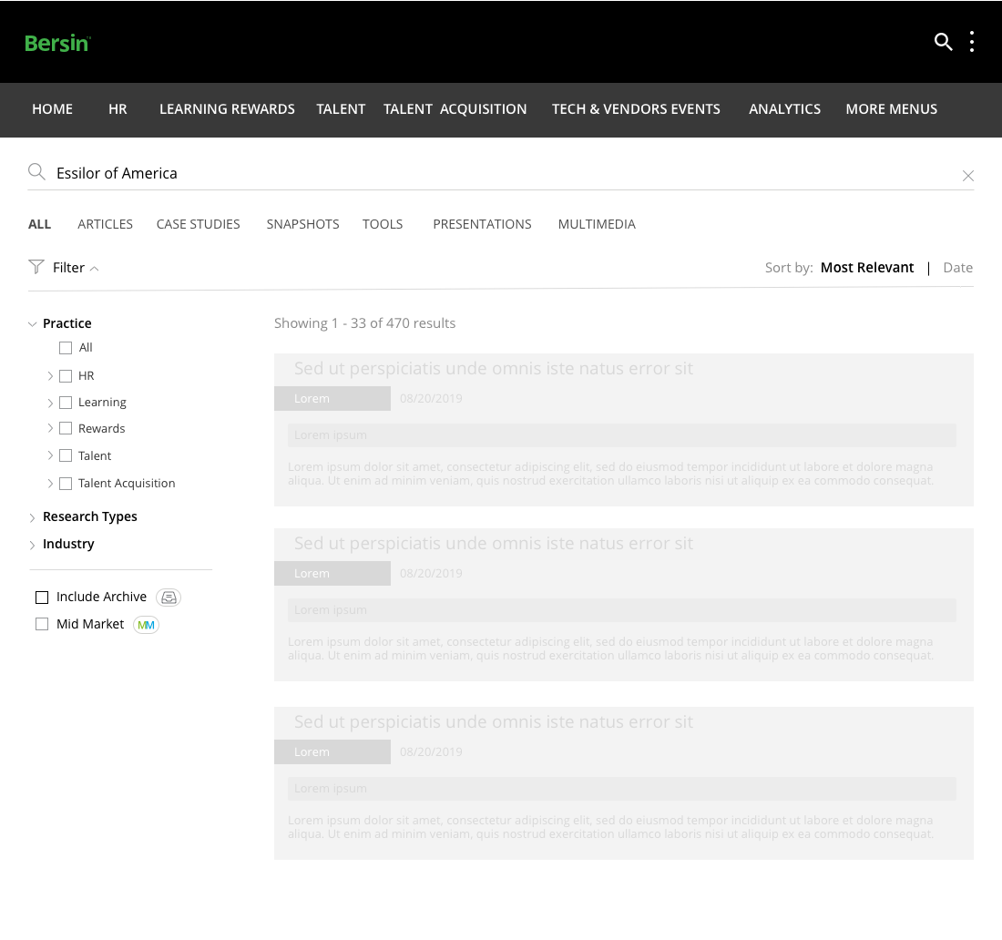
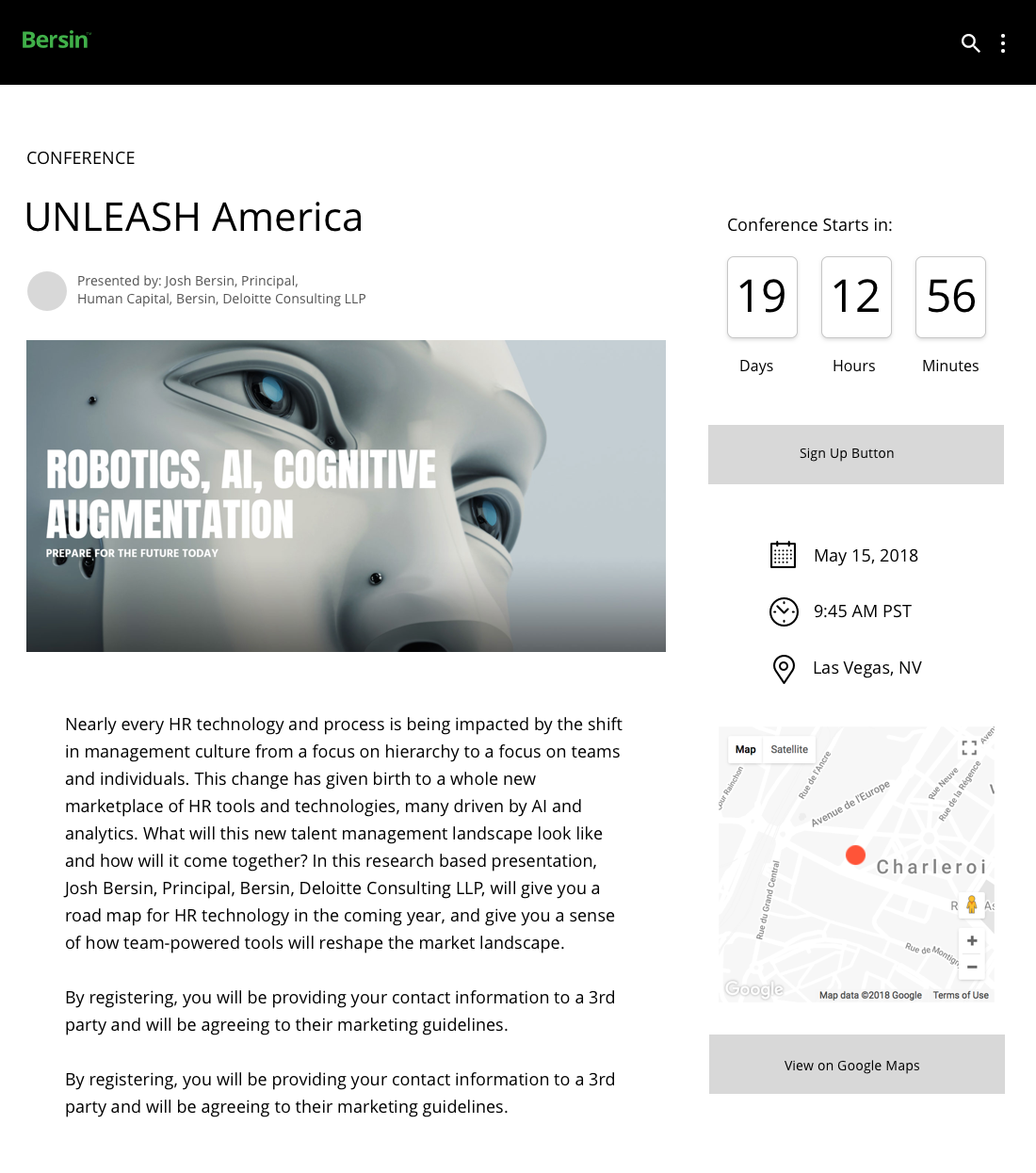
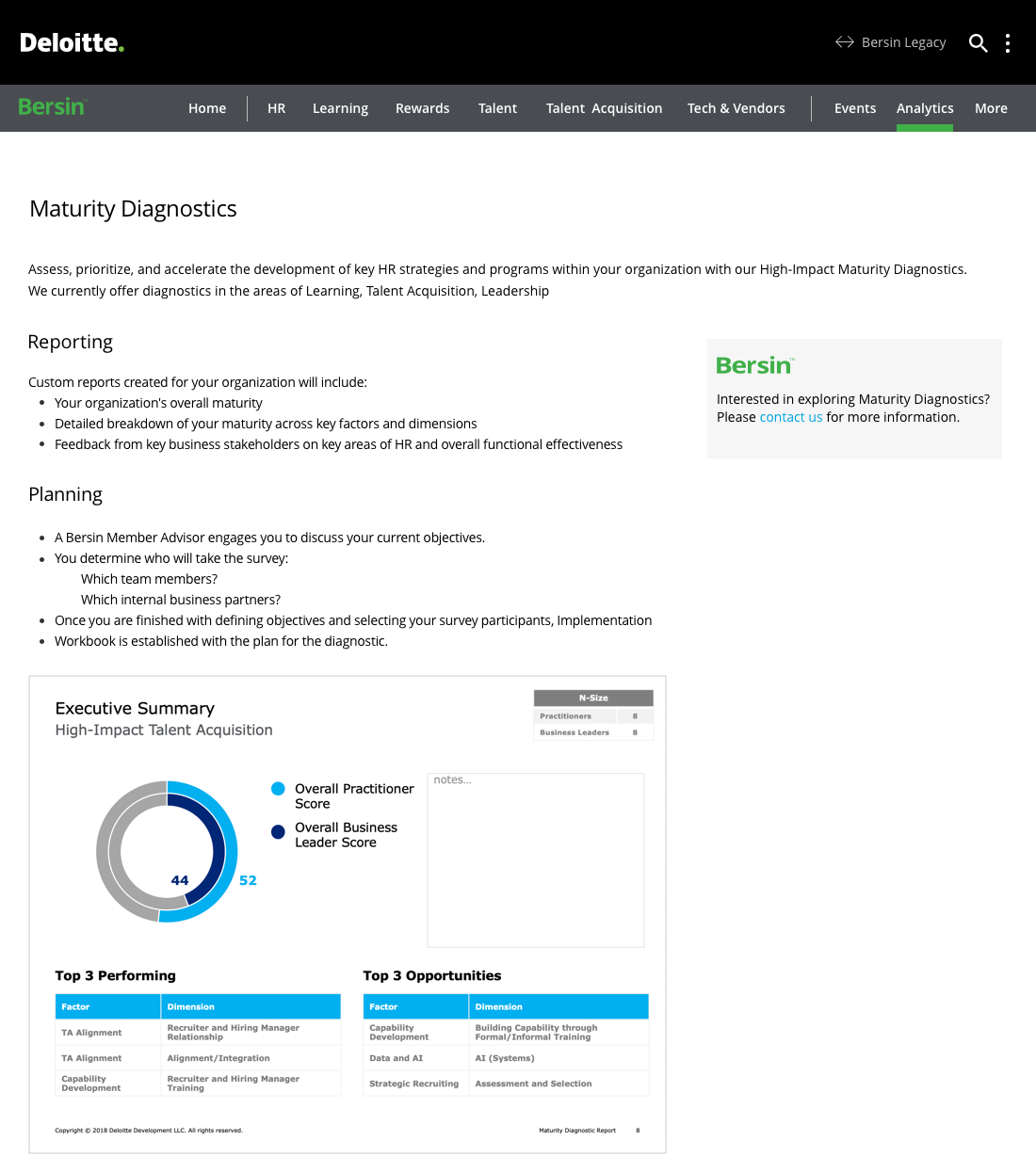
Among these I was heavily involved in the design and development of the member advisors experience, events, service offerings, onboarding, homepage and navigation design as well as MFA, error handling, illustration creative direction, and navigation-to-endnode page design. I was also involved in blending orphaned experiences into the all up 2.0 framework. Below are just a few screen shots of some of work that needed careful attention to detail as they supported the global frameworks upon which the entire project was built.